Eric Douglas Pratt
Andy and Eric Bike Boston
(2017 - Present)
In late 2016, a college buddy of mine moved to Boston. While riding Blue Bikes to the nearest T stop after a night out, the idea was born: we'd get to know our beautiful city by setting a goal to visit every Blue Bikes station in the Boston area.
Keeping track of which stations we had visited and which we hadn't was going to be a challenge, especially as the number of stations kept growing, so I decided to use my talents and make a web app to keep track of it all!
Technical Milestones
The initial cut used vanilla JS to bring together the Google Maps API and the Blue Bikes API into a map charting the trips we had taken thus far. Filled markers indicated visited stations, unfilled markers indicated unvisited stations. For a while, I calculated our percentage completion in the background and printed it out as a console message — it wasn't shown in the UI yet.
This was simple and allowed us to make a rough plan each time of which neighborhood to go to and which stations to hit. Once we started riding, we could bring it up on our phones and confirm whether or not we'd already visited various stations we'd encounter along the way.
The site stayed basic for a time, adding a few features here and there before a ride, until I decided to really turn it into something fun starting in 2020:
- May 2019: Started showing station photos on the map instead of markers to track which stations we'd forgotten to take a photo of. Added a simple responsive pane showing percentage complete.
- May 2020: Ground-up React rewrite using create-react-app and Material UI. Added live station status using the Blue Bikes API. Added station info pane, redesigned map markers, and geolocation.
- June 2020: Added Trips list, single trip view, Stats pane, and Photos pane showing all station photos taken so far.
- July 2020: Added beta version of Time Travel feature on desktop only.
- August 2020: Added Plan a Route feature.
- April 2022: Enabled Time Travel for mobile. Added animated biker icon that traverses the route when viewing a trip. Added Neighborhoods feature.
Stations and Progress
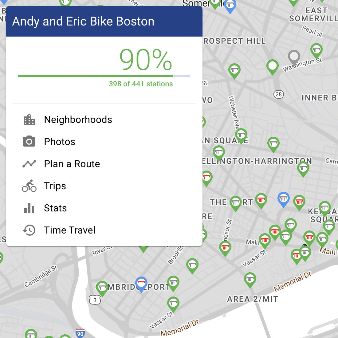
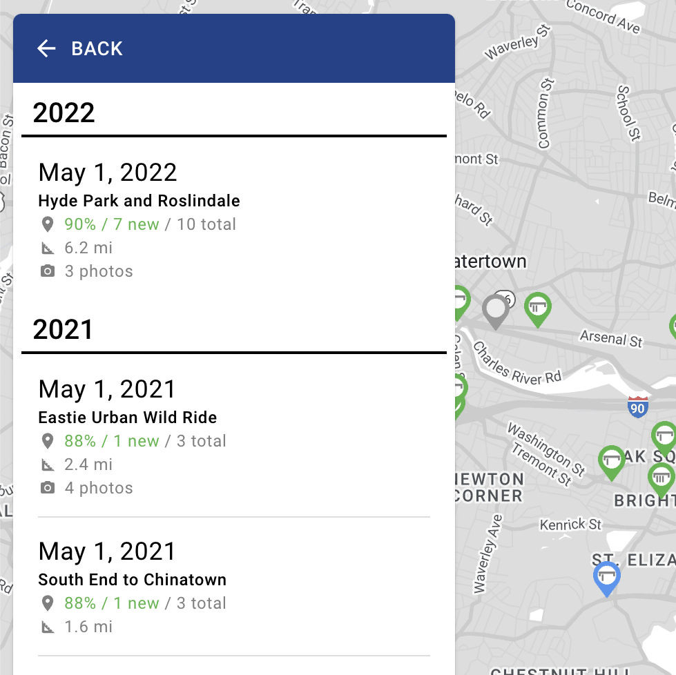
As a map-centric web app, I modeled the UI loosely off of Google Maps, with a floating info pane. Upon first opening the site, you see the progress percentage animate up from zero to the current number, telling you how many stations there are and how many we've visited.
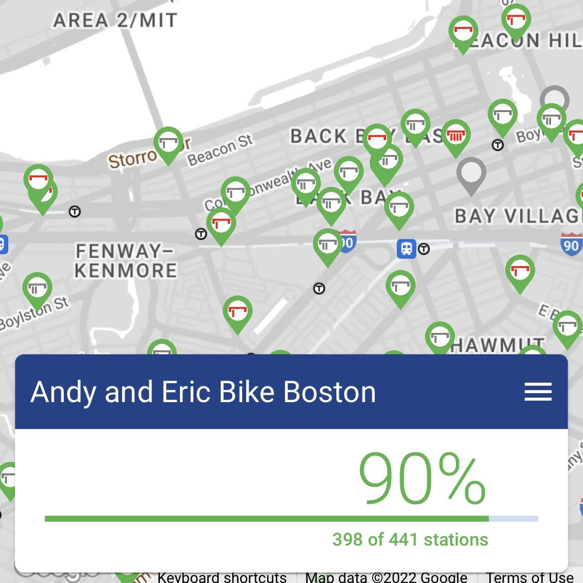
The remainder of the UI displays a map of Boston with markers representing the current Blue Bikes stations and their status. I redesigned the map markers from my initial cut, with the goal of giving you as much information as possible at a glance.
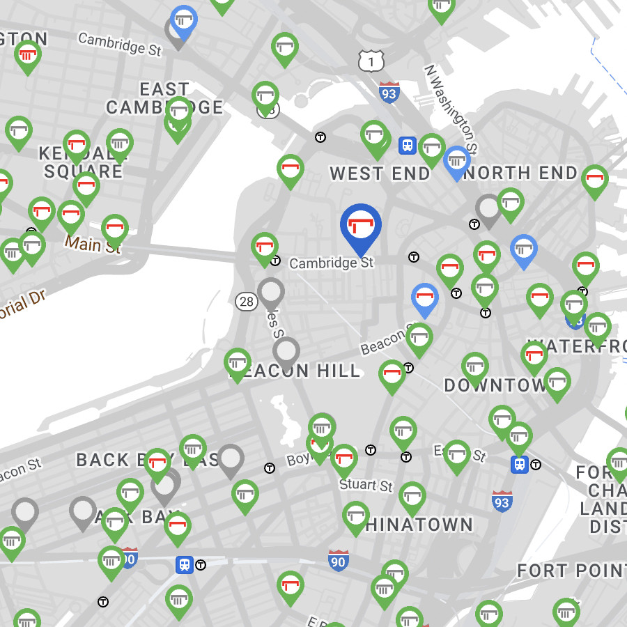
The station marker icons are meant to represent a dock with bikes in it, and show how empty or full a station is. If the icon is red, that means it's a risky case of the station having one or zero bikes or open docks left.
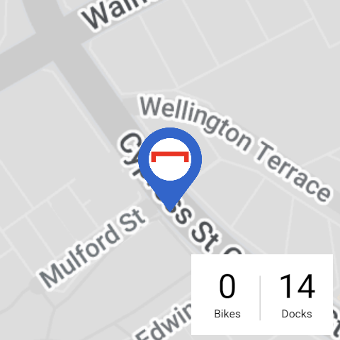
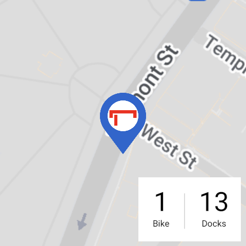
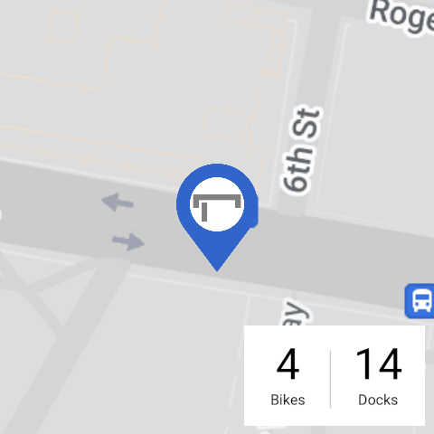
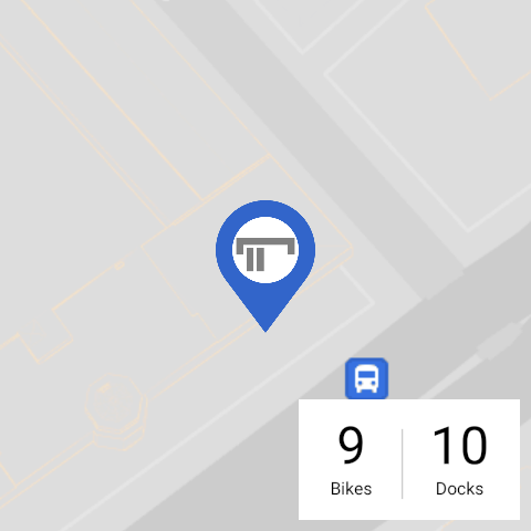
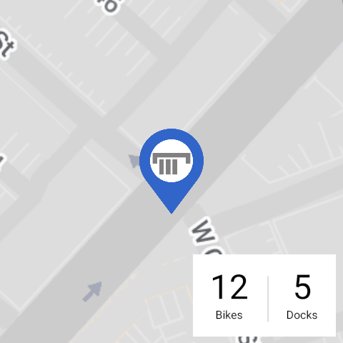
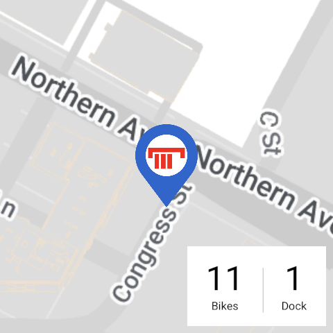
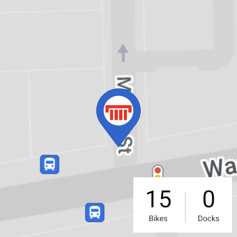
Tapping on a station marker brings up the station info pane, with a photo of the station (if we've been there), when the station was first established, and how many bikes and open docks it has available. Tapping "Back" in the dark blue bar will take you back to whatever view you were previously on before you tapped the station.
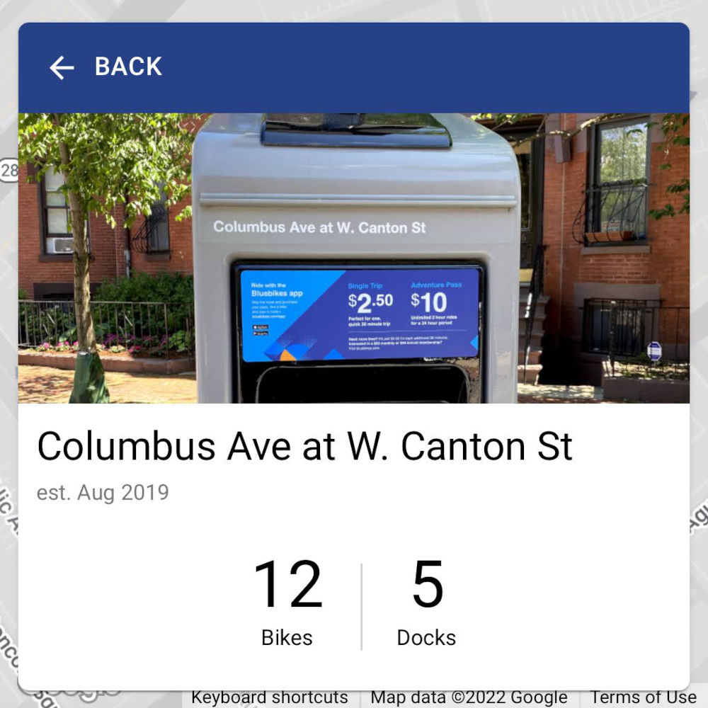
The site is able to display most of this station data even if the Blue Bikes API goes down because I keep my own copy of the list of stations. This also ensures that the station IDs I reference in our trip data don't change.
[
  {
    "id": "3",
    "name": "Colleges of the Fenway - Fenway at Avenue Louis Pasteur",
    "lat": 42.34011512249236,
    "long": -71.10061883926392,
    "photos": [
      {
        "date": "2018-03-31",
        "photo": "photos/colleges-of-the-fenway_2018-03-31.jpg"
      }
    ],
    "firstSeen": 1311884100,
    "oldId": "B32006",
    "hashId": "f83464e4-0de8-11e7-991c-3863bb43a7d0"
  },
  {
    "id": "4",
    "name": "Tremont St at E Berkeley St",
    "lat": 42.345392,
    "long": -71.069616,
    "photos": [
      {
        "date": "2018-06-24",
        "photo": "photos/tremont-st-at-e-berkeley-st_2018-06-24.jpg"
      }
    ],
    "firstSeen": 1314681780,
    "oldId": "C32000",
    "hashId": "f834658f-0de8-11e7-991c-3863bb43a7d0"
  },
  ...
]Due to this cached station data, I'm able to tell — by comparing it to the live Blue Bikes API — when stations disappear, change names, change locations, or when new stations are added. All of these things have happened multiple times over the years, and I developed code that integrates those updates into the cached list of stations. When a station that we've already visited is permanently removed, I mark it as isLegacy and keep it around so the historical trip can still be displayed, and it can still be counted towards the total number of stations visited.
Trips
The simplest way to keep track of our progress is to keep a list of trips we've taken, each with the stations we visited, which the site then dedupes and compares against all the Blue Bikes stations to calculate the percentage of the whole system we've visited.
[
{
id: '1',
date: '2017-05-28',
description: 'Kendall to South Station',
stations: [107, 72, 60, 120, 58, 476, 81, 22]
},
{
id: '2',
date: '2017-08-13',
description: 'Up the Waterfront, Down through Cambridge',
stations: [22, 192, 43, 151, 20, 40, 98, 85, 129, 94, 169, 171, 84, 185, 80, 67, 53, 52],
photos: [
{
full: 'photos/2017-08-13-001.jpg',
lat: 42.374160,
lng: -71.068635,
thumb: 'photos/2017-08-13-001-thumb.jpg'
}
]
},
...
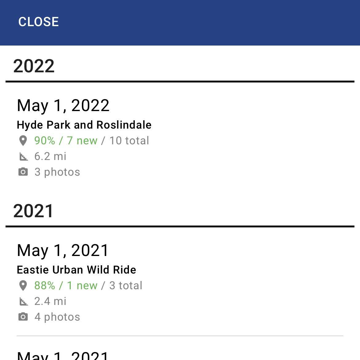
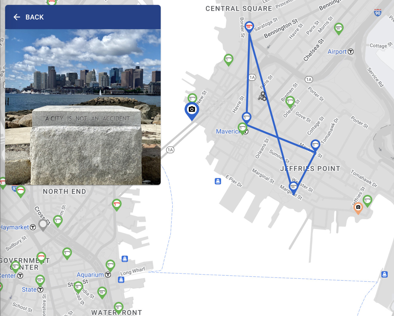
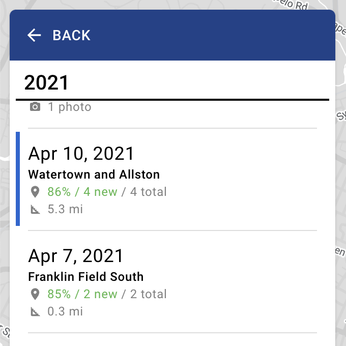
]This makes it fairly simple to show a list of our trips in the UI, ordered from most recent to least recent. Each one shows the progress percentage at the time, the number of stations visited, how many of those stations were new, the rough distance traveled, and if we took any photos during the trip.
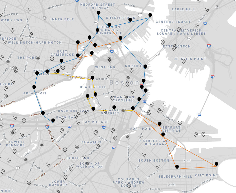
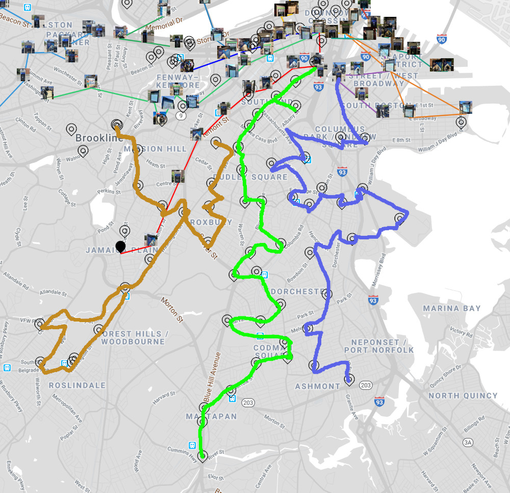
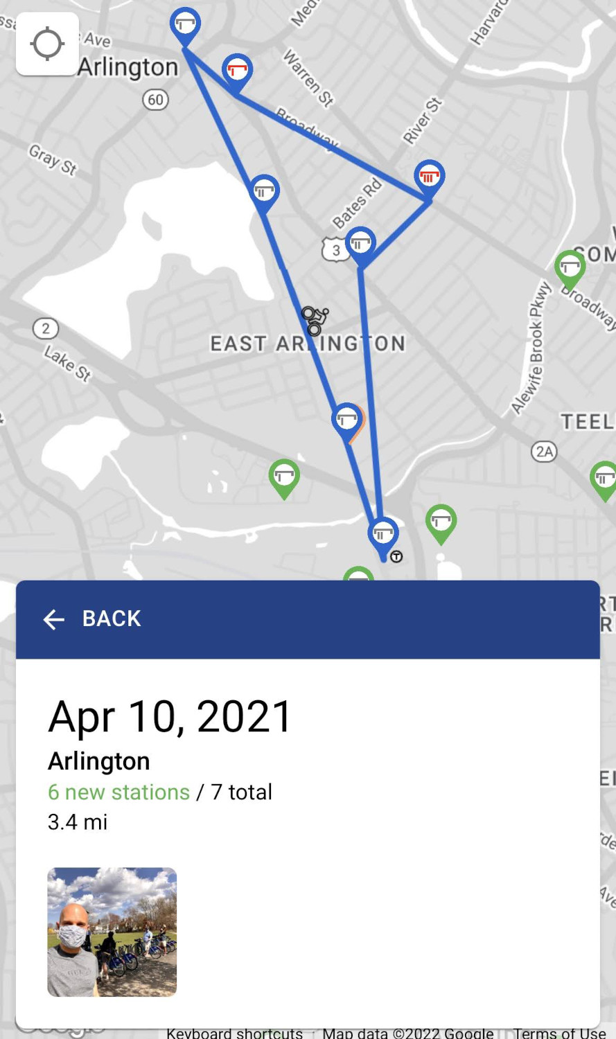
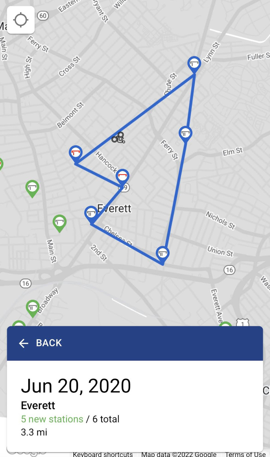
When you select a trip, the map shows the stations we visited and the route we took. An animated biker icon traces the direction we rode in. The info pane distinguishes between how many new stations we visited and the total number we stopped at, shows the rough distance of the trip, and any photos we took along the way.
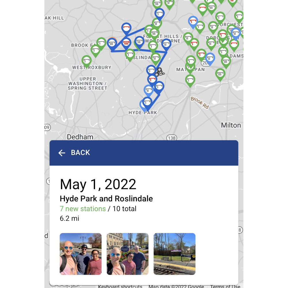
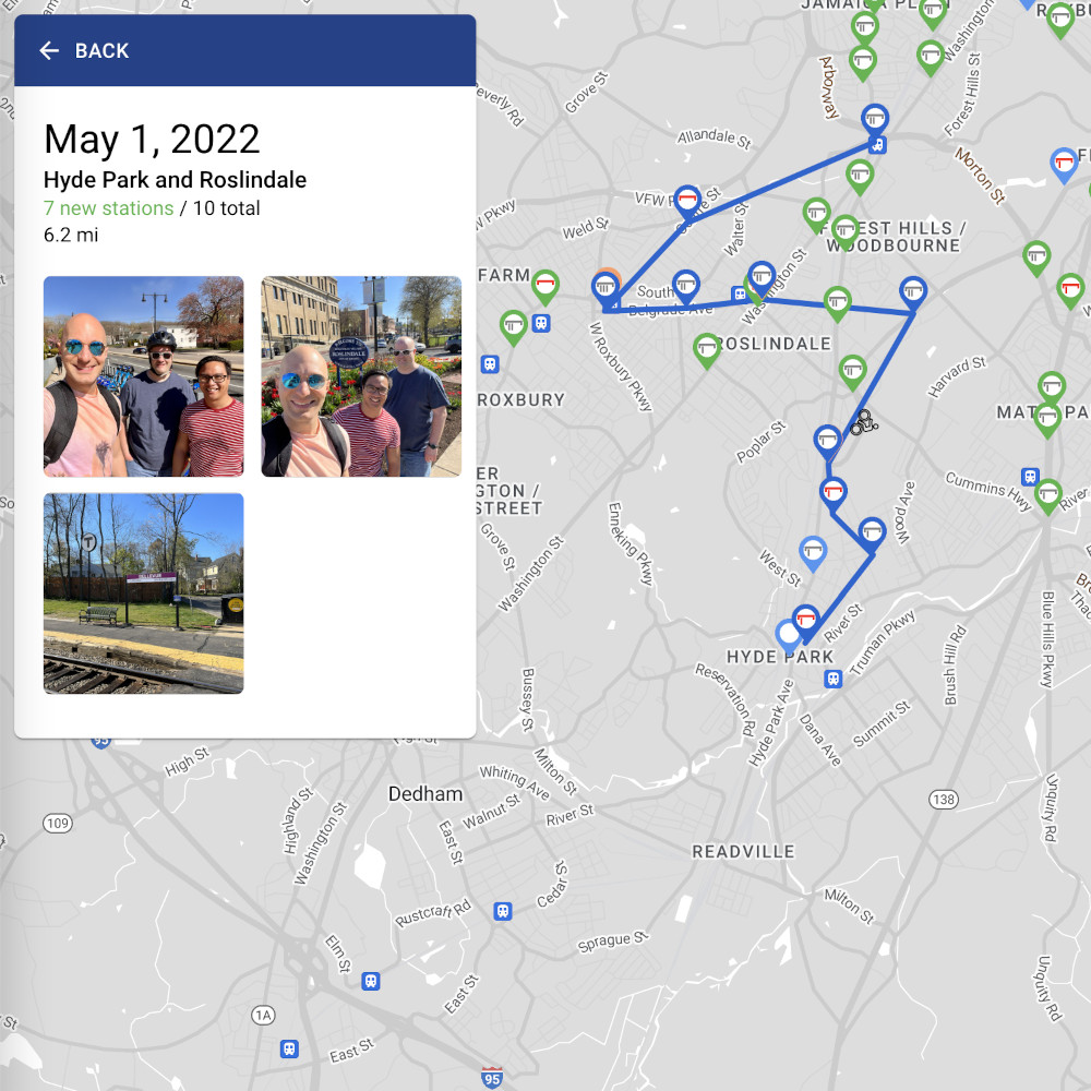
When you select a trip photo, I wasn't content to merely display its thumbnail in the info pane. As you can see in the trip data above, I store the latitude and longitude of where the photo was taken, so I can show photo markers on the map.
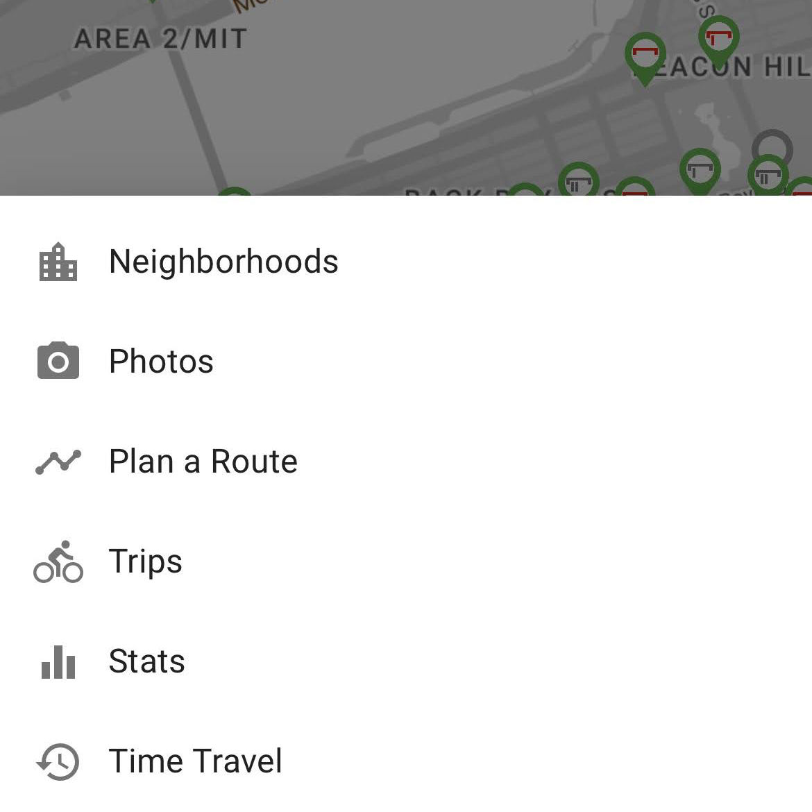
Neighborhoods
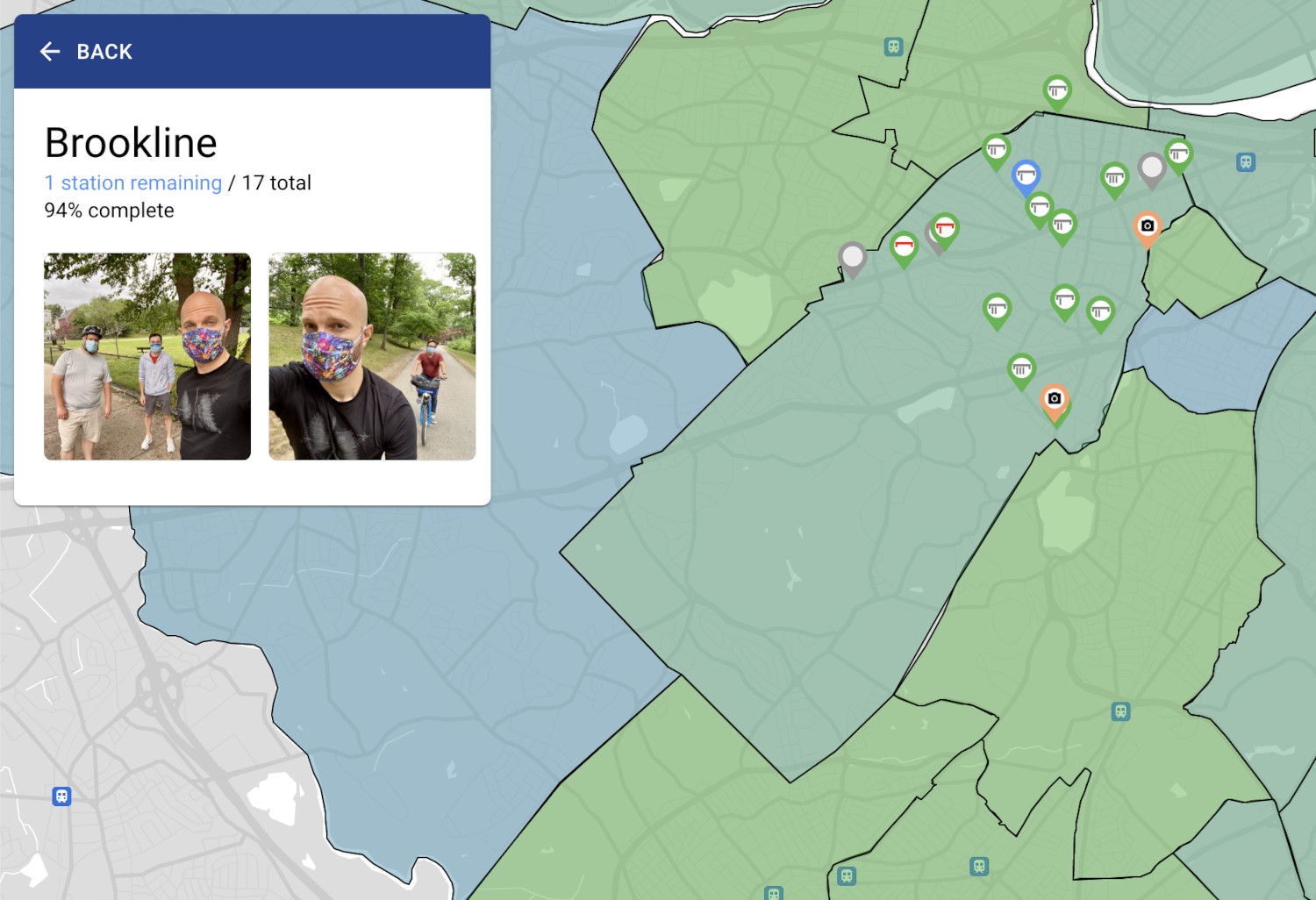
One of the newest features is the Neighborhoods view, where you can see a breakdown of our progress at a neighborhood or town level. Matching the color scheme of the map markers, complete neighborhoods are green, ones with no visits are blue, and there are two shades in between indicating the amount of partial progress.
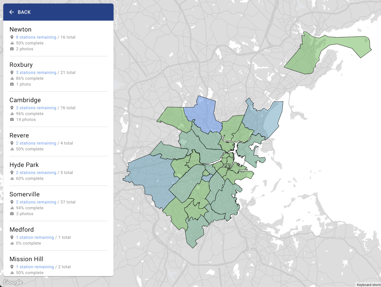
The list of neighborhoods in the info pane is sorted by most number of stations remaining in a neighborhood to least. Complete neighborhoods are sorted alphabetically below.
To be able to show neighborhood polygons on the map, I grabbed the Boston neighborhood boundaries from the official Boston ArcGIS data and surrounding town boundaries from Wikimapia. Wikimapia's data is somewhat imperfect so I'll likely upgrade to a more official source in the future. I even added in a few extra towns beyond the Blue Bikes system, so that when Medford received its first station in June 2022, the site simply started showing it with no further work needed on my part.
Selecting a neighborhood from either the list or the map will zoom into that area and show stations and photos within it, as well as the overall progress percentage for that neighborhood.
Time Travel
When you select a station, you'll note that I display when the station first came online, which is something the Blue Bikes API and even the Blue Bikes app itself don't tell you.
Blue Bikes does provide this data, but it's buried in the monthly data archives they keep for each month since the beginning of the system (back when it was called Hubway). The monthly data is a CSV file containing every bike trip taken that particular month; Hubway is in one format, Blue Bikes is in another.
In order to grab the date a station first came online, I developed two algorithms (one for each format) that run through this data to find the first ride that involves a particular station. Because each month is a separate CSV file, I run it one month at a time. If it finds a "first trip" for a station, I update my cached station data with a firstSeen timestamp (which you can see in the station data above). That way, when my algorithm detects later trips from that station in future monthly data packs, it can safely ignore them, since it knows it's already found that station's first trip.
This not only enables display of a station's established date, it enables a feature I like to call Time Travel.
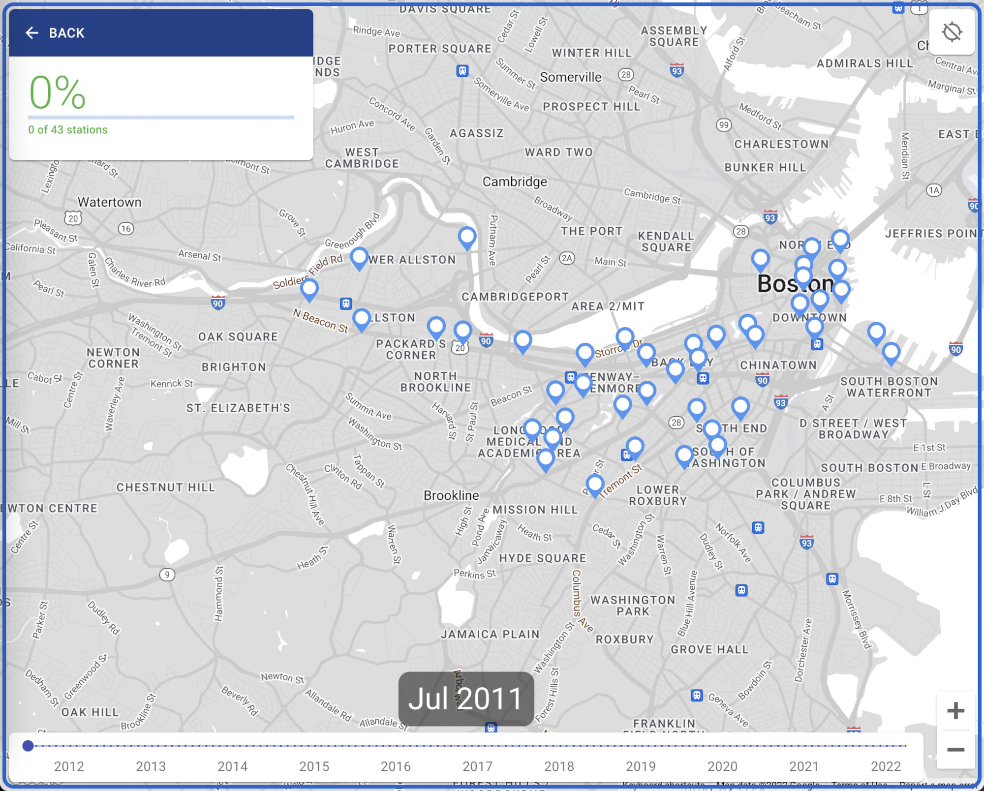
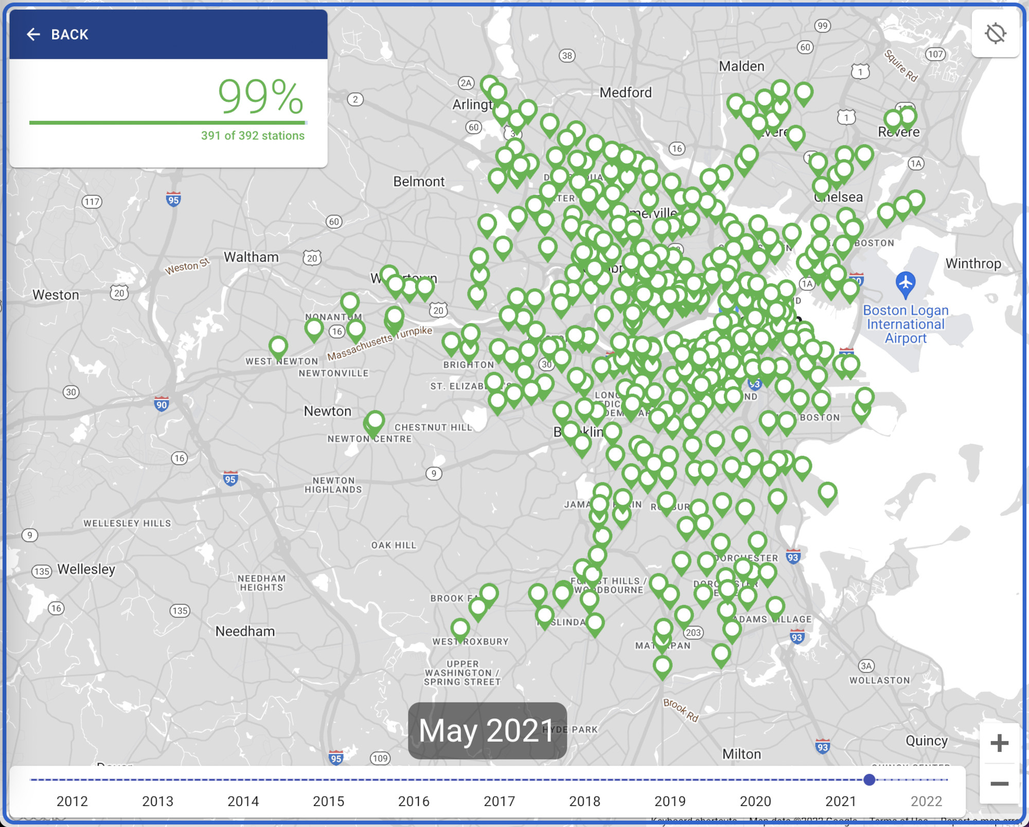
In Time Travel mode, you're given a timeline slider at the bottom of the screen that you can drag to see the evolution of the Hubway / Blue Bikes system over the years. Stations will also turn from blue to green as Andy and I visit them over time.
Route Planning
In the early days, when pondering which route we should take, I'd generally take a screenshot of the site, draw possible routes on it using the iPhone's Markup tool, and send it to Andy for consideration. This was a bit cumbersome and required some finesse to ensure the station markers were still visible after I was done.
To make this easier, I decided to use the site itself to mark a possible route. I already had markers on a map you could click on and a way of drawing routes on the map — it was just a matter of hooking it all up together.
I considered using the Directions API from Google Maps, since that could give us actual biking directions between each station, but found that it cost money. I figured the same straight-line visualization I used for historical Trip view would solve for most of this use case.
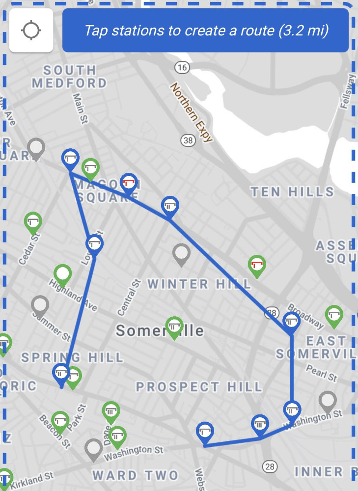
I kept it simple — when you enter the Plan a Route view, it shows you the station map and tells you to "Tap stations to create a route". Tapping station markers in sequence will start to draw a route between them, as well as show you the rough distance of your route in miles.
Once I map out a potential route, I generally take a screenshot and send it to my friends for them to think over. I considered making it a shareable URL, but that seemed overly complex for such a temporary proposal.
As with the distance I display for trips, it won't be 100% accurate to the distance we'll actually bike, since it's as the crow flies between stations, but it gives you a rough idea.
// from https://www.geodatasource.com/developers/javascript
// unit: 'M' is statute miles (default), 'K' is kilometers, 'N' is nautical miles
export const calculateDistance = (lat1, lon1, lat2, lon2, unit) => {
if ((lat1 === lat2) && (lon1 === lon2)) {
return 0;
}
else {
var radlat1 = Math.PI * lat1/180;
var radlat2 = Math.PI * lat2/180;
var theta = lon1-lon2;
var radtheta = Math.PI * theta/180;
var dist = Math.sin(radlat1) * Math.sin(radlat2) + Math.cos(radlat1) * Math.cos(radlat2) * Math.cos(radtheta);
if (dist > 1) {
dist = 1;
}
dist = Math.acos(dist);
dist = dist * 180/Math.PI;
dist = dist * 60 * 1.1515;
if (unit==="K") { dist = dist * 1.609344 }
if (unit==="N") { dist = dist * 0.8684 }
return dist;
}
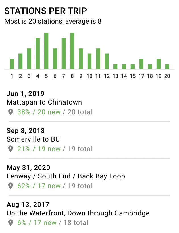
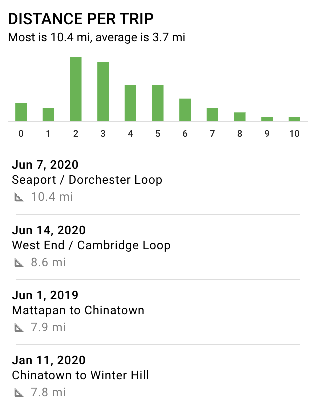
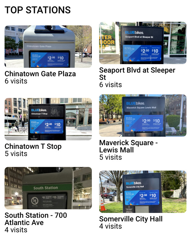
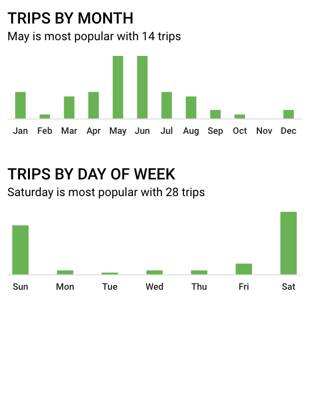
};Statistics
To gain additional context on our journey, I added a Stats section showing various metrics on our trips over the years. Each trip and station listed are clickable and will take you to that trip or station.
Fit and Finish
One of the qualities, in my opinion, that distinguishes a good front-end engineer from a generic software engineer is putting in additional effort beyond the wireframes/comps provided by designers to ensure a smooth user experience with minimal frustration. Below are a few examples.
The Trips list is grouped into sections by year. For ease of seeing which section you're in when the list is scrolled down, I used "position: sticky;" on the headers along with a z-index so they are always visible up top until the next year replaces it.
Also, upon selecting a trip and then hitting "Back" to return to the trip list, I made sure a few things would happen: (1) the trip you had just selected would be highlighted in the list, (2) the selected trip would still be visible on the map, and (3) the list would be scrolled as necessary to show the selected trip.
This required a bit of work. The useRef hook in React allows me to scroll the appropriate trip button into view when an activeTrip we want to highlight is passed into the TripList component below.
In order to make sure that activeTrip is passed in when backing out to the trip list from the trip view, I pull a little trick one step prior, back when you selected the trip from the list in the first place. Before I push the TRIP object onto the view stack (activating the Trip view), I replace the TRIP_LIST object in the view stack with a new TRIP_LIST object containing a data payload: the activeTrip. That way, when you hit "Back" and the view stack is popped, the TRIP_LIST object already has the data we need.
function TripList({ activeTrip, ... }) {
  const scrollRef = useRef(null);

  useEffect(() => {
    if (activeTrip) {
      setTimeout(() => {
        if (scrollRef && scrollRef.current) {
          scrollRef.current.scrollIntoView({
            block: 'start',
          });
        }
      }, 0);
    }
  }, [scrollRef]);

  return (
    <div className="TripList">
      ...
        {year.trips.map(trip => {
          const isActive = activeTrip && activeTrip.id === trip.id;
          return (
            <TripButton
              isActive={isActive}
              ref={isActive ? scrollRef : null}
              ...
            />
          );
        })}
      ...
    </div>
  );
};Another tricky case is centering the map appropriately on the limited screen real estate of mobile. Google Maps provides a fitBounds() function that takes two corner points denoting an area, as well as how much padding it should leave on the sides. In my design, the map takes up the full screen and the info pane floats on top. When viewing a trip's details, there may or may not be photos to display, meaning the info pane can vary in height.
Telling the fitBounds() function to leave just the right amount of room so the trip would be vertically centered in the space above the info pane required me to break out the useRef function again. I attach a ref to the info pane element and pass it into the MapComponent.
const MapComponent = ({
  activeTrip,
  infoPaneRef,
  ...
}) => {

// handle active trip
useEffect(() => {
  if (
    activeTrip
    && activeTrip.stations
    && activeTrip.stations.length > 0
  ) {
    ...

    // center the map on the new route
    setTimeout(() => {
      viewStations(
        activeTrip.stations,
        activeTrip.photos,
        infoPaneRef.current.offsetHeight
      );
    }, 225);
  }
  ...
}, [activeTrip]);

const viewStations = (
  stationIds,
  photos,
  infoPaneHeight = 280
) => {
  ...

  map.fitBounds(
    bounds,
    breakpoint === BREAKPOINTS.MOBILE
      ? {
        bottom: 20 + infoPaneHeight,
        left: 20,
        right: 20,
        top: 30
      }
      : {
        bottom: 40,
        // info pane is a fixed width on desktop
        left: 360,
        right: 40,
        top: 40
      }
    );
  };

  ...
};Conclusion
Overall, I'm proud of the way the Andy and Eric Bike Boston site showcases different ways to slice related data (stations, trips, photos, neighborhoods) into useful visualizations, all while providing the photographic and historical evidence to prove that we have indeed visited nearly all the stations in the system over the years!
The React overhaul with station bikes/docks status, visited/unvisited status, geolocation, and route planning has proven invaluable to us out on a ride, so we don't have to keep switching between the site, the Blue Bikes app, and Google Maps. I have a few ideas for enhancements in the future that will make things even smoother and give even greater context to our journey for site visitors.
The journey itself has been a lovely way to visit all the various squares and neighborhoods in the Boston area, many of which we probably wouldn't have visited otherwise! It's given us a greater understanding of our city, a decent amount of exercise, and some valuable lessons on how to survive and thrive while biking the chaotic streets of Boston.