Fundamentals: CSS Box Shadow
May 8, 2013
The box-shadow property in CSS is an easy and powerful way to create drop shadows off of an element. It can even be used in unexpected ways to achieve certain non-shadow-type effects!
1. Overview
First, let's look at the box-shadow property's attributes. Here's a simple example:
.box1 {
  box-shadow: 3px 3px 5px 0px black;
}
The order of the attributes is as follows:
- Horizontal offset: a positive value moves the shadow to the right; a negative value moves the shadow to the left.
- Vertical offset: a positive value move the shadow down; a negative value moves the shadow up.
- Blur radius (optional): a value of zero means no blurring; the higher the value, the blurrier the shadow will be.
- Spread radius (optional): a value of zero means the shadow will be exactly the same size as the box. Positive values increase the size of the shadow; negative values decrease the size of the shadow.
- Color (optional): as with any color in CSS, this can be a keyword (e.g. black), a hex value (e.g. #000 or #000000), an rgb function (e.g. rgb(0, 0, 0)), or an rgba function (e.g. rgba(0, 0, 0, 0.3)).
- Inset (optional): when the inset keyword is present, the shadow will be inside the box. When it is not present, the shadow will be outside the box.
So this shadow will be moved three pixels down and right from under the box, it will be blurred by five pixels, it will be exactly the same size as the box, and its color will be black. Here's what that looks like:
2. Inset Shadow
You can also put a shadow inside a box, like this:
.box2 {
  box-shadow: 3px 3px 5px 0px black inset;
}
Just as before, the shadow is moved three pixels down and right, it's blurred by five pixels, it's the same size as the box, and its color is black. The only difference now is that it's inside the box rather than outside. Here's what that looks like:
3. Outlines
By reducing the horizontal and vertical offset to zero, reducing the blur radius to zero, and increasing the spread radius, you can generate an outline instead of a shadow:
.box3 {
  box-shadow: 0px 0px 0px 5px black;
}
But wait a minute, isn't that the same as a border? We already have a way of generating borders in CSS:
.box4 {
  border: 5px solid black;
}
What happens if you combine the two, making one of them blue so we can distinguish between them?
.box5 {
  border: 5px solid blue;
  box-shadow: 0px 0px 0px 5px black;
}
DOUBLE BORDER! Very fancy.
4. Multiple Shadows
What if a design calls for a triple or quadruple border on a box? We've already used a border, and we've already used a box-shadow. Are we out of luck?
Nope! Good news is, that unlike the border property, you can pretty much have as many box-shadows as you want! You just need to repeat the same set of attributes, separated by a comma:
.box6 {
  border: 5px solid blue;
  box-shadow: 0px 0px 0px 5px #0000AA,
              0px 0px 0px 10px #000077,
              0px 0px 0px 15px black;
}
This lets you get into all sorts of craziness. You can see here that shadows listed later in the list appear underneath shadows listed earlier:
.box7 {
  box-shadow: 10px 10px 0px -5px black,
              -10px -10px 0px -5px black,
              5px -5px 0px 0px #8888FF,
              -5px 5px 0px 0px #FFC457,
              10px -10px 0px 0px blue,
              -10px 10px 0px 0px orange;
}
5. One Side Only
Often, a design will call for a shadow on only one side of a box. You can do that by only offsetting the shadow in one direction, and then using the spread radius to shrink the shadow a bit so it doesn't appear on the two adjacent sides of the box. Keep in mind that when you shrink the shadow, your offset will have to be larger to get the shadow to come out from behind the box:
.box8 {
  box-shadow: 0px 10px 5px -5px black;
}

.box9 {
  box-shadow: 0px 10px 5px -5px black inset;
}
6. Transparency
Most of the time, we don't want our shadows to be opaque. The blur radius allows our shadow to fade nicely from our shadow color to whatever's behind the shadow, but what if (1) we don't want to use a blur radius, or (2) the shadow is offset enough such that the blur radius only goes so far in making the background visible?
This is where the rgba() function comes in when setting the shadow color. The "a" stands for "alpha", which means a value that sets how much transparency a color has.
.box10 {
  box-shadow: 20px 20px 10px 0px rgb(0, 0, 0);
}

.box11 {
  box-shadow: 20px 20px 10px 0px rgb(20, 20, 20);
}

.box12 {
  box-shadow: 20px 20px 10px 0px rgba(0, 0, 0, 0.8);
}
The first box has a normal shadow with a black background. We can lighten up that shadow a bit by bringing up the RGB values to a gray, but we still can't see what's behind the shadow. The third box has exactly the same shadow as the first box, except we've set the black background at 80% opacity by specifying 0.8 as the alpha value.
7. The Exercise
Use this CodePen to get started!
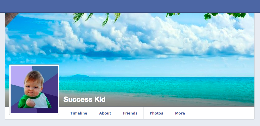
Let's pretend we work for Facebook and we're developing the latest UI for the top of a user's Facebook profile. Here's what we have so far:
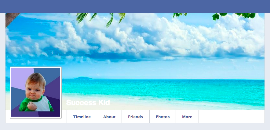
This looks nice, but as you can see, the user's name, "Success Kid", is a little hard to see on top of the cover photo, since the cover photo is so light.
See if you can use box-shadow to put a semi-transparent gradient behind that name to make it more legible, like this: